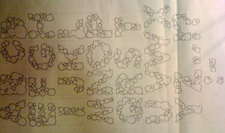
After finishing the bubble typeface which i create for Claudia we then had a group critique, where we presented our finished typefaces to a group of people for them to give us feedback back on them.
My group critique was quite successfully i felt, I didn't really receive any negative comments, some of the feedback that i received was the bubbles were too cluttered and sometimes hard to read. I also was given a few ideas to experiment with; one to try to build up the typeface starting with one bubble adding one to each letter to illustrate become more bubbly, also to try looking at lower-case because even though it may not represent Claudia's character as well as using upper-case would, the lower-case letter form are more smooth, round and bubble like and would maybe work better finally i was told to look at how numbers would work with this typeface.
My group critique was quite successfully i felt, I didn't really receive any negative comments, some of the feedback that i received was the bubbles were too cluttered and sometimes hard to read. I also was given a few ideas to experiment with; one to try to build up the typeface starting with one bubble adding one to each letter to illustrate become more bubbly, also to try looking at lower-case because even though it may not represent Claudia's character as well as using upper-case would, the lower-case letter form are more smooth, round and bubble like and would maybe work better finally i was told to look at how numbers would work with this typeface.
From these experiments I created the typeface on illustrator, using a similar style to my original typeface but trying to use as little bubbles as possible.
I then looked at making the letter-forms looking even more like bubbles by adding little reflections onto them and experimenting with that.
Then after experimenting with different fills and colours i found that the grey fill with black stroke was the most visually appealing.
However after responding to the feedback given in the critique, i still feel that my original typeface was more successful, certain letters such as C and E i feel do not work whilst working in this style; however i still like this outcome i think it works really well as a typeface.


