Tuesday, 31 January 2012
Monday, 30 January 2012
Wednesday, 25 January 2012
Tuesday, 24 January 2012
after effects - tutorial 24/1/12
The final after effects session.
Things we are going to be looking at;
- key framing
- 'grouping'
- audio
''press U to see all the animated properties of a layer''
The dots along the motion path represent frames and because the dots are equally spaces it shows the object moves at a constant speed.
To make an animation run more realistically you can ease in and ease out by selecting the keyframe and choosing one of them, this allows the animation to either accelerate or decelerate giving you a more realistic animation movement.
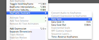
You can use the 'easy ease' option by selecting to keyframes and the going to animation - keyframe assist - easy ease, which will accelerate out then decelerate to a stop.
The graph editor
Select a layer property (like position) and click the graph tool.
The graph of a layer easing in and out, the keyframes are shown as white dots
The graph of an object moving at a constant speed.
By moving these curves you can customise the movement of the speed of the object, to ease in and out just as you would lie.
Making a pendulum swing
Using the rotation tool, change the anchor point to allow the pendulum to swing, to do this press Y and move it out side of the shape, then keyframe your starting angle and ending angle.
Click the graph thing then change it to 'edit speed graph'
This is the pendulum starting off slow and then picking up pass and slowing down.
Parent teacher layer.
In after effects you can select a layer and select it as the parent layer to other layers, this is helpful so you can do complex animation using as little keyframes as possible.
click rove across time on the silly confusing layers on the graph and it should smoothen it out.
Friday, 20 January 2012
soundtrack.
Before beginning animating i felt it was important to select the song which i would of liked to use, so that i had something to animate to, something to time the movements with.
Something that i feel would work really well for my animation is something, jazzy, upbeat but with a slow tempo, something ambient.. just some nice happy, jazzy, 'rich' music.
I asked around for some ideas that would work well,
something similar to the sounds of Mr Scruff and Quantic.
here is a list of artists that would work really well;
-Mr Scruff
-Quantic
-Bonobo
-Luke Abbot
-Attress
-Four tet.
..so i began filtering through their songs to narrow down the perfect track for my animation.
here are the songs which i picked out that i thought would work really well for the pase and feel i would like for my animation.
Keaver and brause - awake
Quantic - transatlantic Quantic - time is energy Bonobo - kong
All very similar songs, with a jazzy upbeat feel which would work great for my animation however i feel that quantic - transatlatic would work best by far, just a nice happy beat, with lots of beats and trumpets which would work really nice to time an animation to, however i now had to loop and cut out the key parts of the track which i wanted in my animation, initially i only wanted the first 5 second and the middle part of the track however it doesnt last long enough without changing completely so using audio editing software i cut out the start which i wanted and then the middle part, timed them together so they sounded in time. Then looped the part from the middle which i wanted over and over again so the song lasted long enough.
Something that i feel would work really well for my animation is something, jazzy, upbeat but with a slow tempo, something ambient.. just some nice happy, jazzy, 'rich' music.
I asked around for some ideas that would work well,
something similar to the sounds of Mr Scruff and Quantic.
here is a list of artists that would work really well;
-Mr Scruff
-Quantic
-Bonobo
-Luke Abbot
-Attress
-Four tet.
..so i began filtering through their songs to narrow down the perfect track for my animation.
here are the songs which i picked out that i thought would work really well for the pase and feel i would like for my animation.
The final songs which i narrowed it down from were these;
All very similar songs, with a jazzy upbeat feel which would work great for my animation however i feel that quantic - transatlatic would work best by far, just a nice happy beat, with lots of beats and trumpets which would work really nice to time an animation to, however i now had to loop and cut out the key parts of the track which i wanted in my animation, initially i only wanted the first 5 second and the middle part of the track however it doesnt last long enough without changing completely so using audio editing software i cut out the start which i wanted and then the middle part, timed them together so they sounded in time. Then looped the part from the middle which i wanted over and over again so the song lasted long enough.
cutting out the start
looping the middle.
Sunday, 15 January 2012
initial ident concept
Decided it get started creating something for my top 10 brief by attempting to create an ident.
The idea behind the ident was to have bill gate's head rise up and then a pile of coins build up beside him which would grow and grow while bill gate's head followed the coins rising, representing his wealth, so the camera would track the two rising up before stopping and being struck down with the title of the programme.
I began by creating the components i would need in illustrator, i vectored the coin which would be copied and copied ontop of each other in after effects to build up piles.
cut out bill gate's head
added the title.
Then on after effects using a mask i created a feather edge around the sides of the animation to give it a really nice finish.
using the graph editor i changed the pase the coin fell to give it a much more realistic motion path.
Animated the fist coin falling then copied and pasted the layer setting it off at a big of a delay and raising it slightly to give it the impression that the coins were rising, then copied and pasted all the coins, and by setting the first one as the mother layer it allowed me to more them all slightly to the side to create another pile, set it off a couple of seconds later to give the impression 2 piles of coins were rising up.
This is the first stage of the animation and where things really started to mess up, i really liked the way the animation was going but it was just getting confusing the amount of layers that were building up, one layer for each coin which was slowly growing and growing.
Things kept messing up, couldnt get all the coins to move at the right time and in the way i would of liked them to so they just werent piling up correctly.
Managed to crack it and finish it off, however it took me absolutely ages, i dont think my after effects skills are good enough to try such a mammoth attempt at an ident.
Still i am quite happy with the end result, i feel with some tweeks here and there it could make a really smart ident.
Saturday, 14 January 2012
infographics test
Trying to animate a different type of infographic, bar-charts.
thought this would be quite easy but it was surprisingly difficult, having the barcharts raise up from the bottom of the screen. Im sure once i get abit more use to how after effects it will be allot more easier for me.
I tried adding a texture to this animation to see how the it would look, which i thought gave it a really nice finish, i used this green carper texture overlayed it over the animation and lowered the opacity.
Friday, 13 January 2012
infographics test
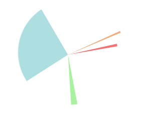
Using the radial wipe again i tried a different approach, having lots of segments of the pie chart going off at different times and sizes slowing building up to create a pie chart.
infographics animation tests
began testing out how to animate infographics, i found an effect called radial wipe which works perfectly for animating things such as pie charts.
This type of infographic would work perfectly within my final sequence.
This type of infographic would work perfectly within my final sequence.
Started by added a feathered mask around the edge of my composition to give it a nice finish.
then using the radial wipe you set the start angle and transition to how you would like it to start then move along to the last key frame and spin them to make it appear as if the pie chart was building itself infront of you, really smart effect.
Thursday, 12 January 2012
colour pallet?
Trying to distinguish my colour theme for my animation before going ahead and animating it,
from my research similar illustrations as to what i would like to produce use allot of bright colours and visually appealing colours which grab your attention and often reflect upon the topic of discussion, colours such as bright greens to represent money and wealth and blues and purples to represent negative subjects such as war.
Reds and yellows to keep the mood and feel of the animation upbeat, where as greens and gold to represent wealth and blues to represent cold parts.
from my research similar illustrations as to what i would like to produce use allot of bright colours and visually appealing colours which grab your attention and often reflect upon the topic of discussion, colours such as bright greens to represent money and wealth and blues and purples to represent negative subjects such as war.
Wednesday, 11 January 2012
crits feedback
feedback from my crit,
allot of interesting things mentions and good ideas for directions to go in.
the main thing is i need to get started with pulmonary animations, testing out my ideas.
allot of interesting things mentions and good ideas for directions to go in.
the main thing is i need to get started with pulmonary animations, testing out my ideas.
crits
This shows how visually we would like our animation to look in order to receive feedback as to wether it would work or not..
Subscribe to:
Comments (Atom)


