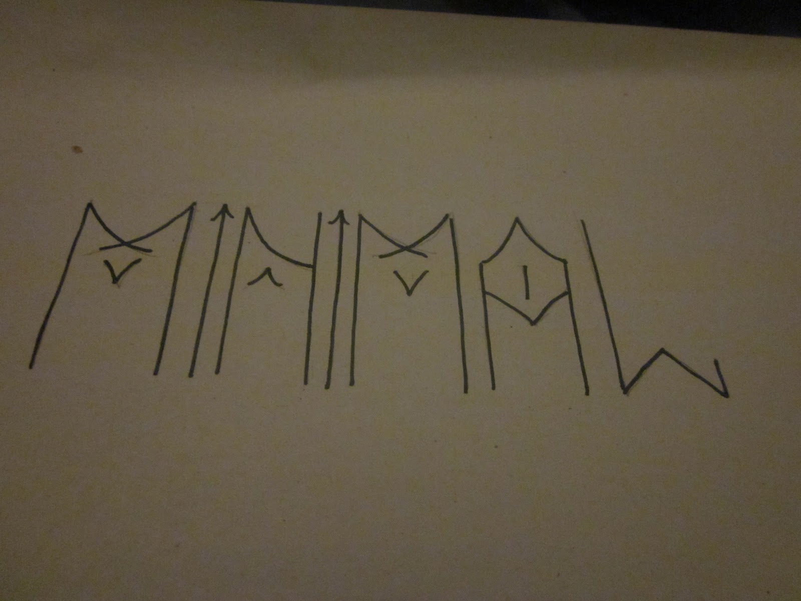
Began mocking up my favourite logo design on illustrator to finish it off neatly, really liked the way it turned out, very simple, minimal and straight to the point, shortening the word 'minimal' to just the consonants 'mnml' however i felt it could still do with some development so i began tweaking it.

Experimenting with different colours and shades of grey to see how they would work, however i still felt black had still worked the best.


inverting the design still didnt improve the design.

then tried to make the design more minimalistic by merging the letterforms, the idea seemed to work in my head however when i got round to making it on illustrator it just didnt go anywhere, the letter forms look messy and its hard to read.


experimenting with different weights.


making the logo 3 dimentional

then i started to go a little wild, adding details which wernt really neaded, experimenting with different shapes and moving more and more away from the minimal concept, everything i did didnt seem to improve the logo in the slightest.


i began to like what i did here with the logo inside another shape.


then finally found a developed logo which i felt was strong.

the triangle inside the hexagon looks nice enough as it is, however with my logo inside it just makes the design really stand out.