Thursday, 27 December 2012
Wednesday, 12 December 2012
Tuesday, 11 December 2012
end of module self evaluation
I
am generally pleased with the outcomes that I have produced
throughout this module, most of them anyways, however I feel that I
have been let down massively by time management with a lot of my
briefs not reaching the potential that they could of reached. However
I have made mass improvements design-wise during this module, my main
intention for this module was to fully develop my type and layout
skills by choosing type heavy briefs based on areas that I would of
liked to improve. I have began to care a lot more about type and
layout within my design work which I feel has helped improve my
outcomes massively.
Working
collaboratively has been one of things that have helped improve my
design skills massively, taking on board ways of approaching design
work by others, sharing skills and helping each other in the areas
that we are not completely comfortable in, mine being type and layout
which I have a learnt a lot of from working with Michael.
Another
area which let me down massively however was my choice of briefs, I
originally intended on choosing briefs which would allow a lot of
creative freedom for outcomes allowing my to be completely
experimental with my design work. However in the end I decided to
settle for live briefs over the fun creative briefs, meaning most of
my outcomes for this module have been very corporate lead, designing
things that are fit for purpose over designing for aesthetics. Which
is where in the future I need to improve, I need to find the balance
between design for purpose and design for aesthetics in order to
fully develop my graphic design work and come out of the course with
a strong aesthetically pleasing portfolio.
I
also need to improve my time management skills dramatically, this
module has been a huge wake up call for me in terms of my
organisation, not knowing when to end briefs as well as not
allocating enough time to start and finish others has left me really
stressed over the past few weeks trying to pull together all the work
I have done into outcomes. Next module I really need to keep on top
of this if I want to improve my grades, I say it at the end of every
module, but things like blogging as I go along so it doesn’t all
pile up at the end causing a lot of unnecessary stress, starting
projects at the word go instead of messing around doing little bits
for a few weeks and then stressing to produce the final outcomes in
time.
My
strengths within this module have been concept development, coming up
with ideas for projects and developing them to produce really strong
outcomes. Also I feel I have developed my type and layout skills over
the past few months to say that this has been a huge strength for me,
type being the main focal point for this module and by the end I feel
for some of my briefs I have produced some of my best work up to
date.
Next
module I really need to choose my briefs more wisely, choosing
subject areas that I am interested as well as a range of different
briefs so I don’t get bored doing similar corporate work 4 times
over. I feel this module has helped set a grounding as to where I
would like to take my practice, designing more for designers rather
than corporate design, meaning I can have fun and be inventive with
my outcomes, I feel the area that I would like to take my practice
would be design for the cultural circuit, allowing me to be creative
with my outcomes and have fun with each brief.
proper bait - test print
Test print to make final amendments before printing the whole book.


numbers not central at the bottom

text run too far the edge


proper bait - screen print
Screen printed covers,
really annoyed at myself here. i spent soo long rushing around trying to expose the screen and print before the print room shut that i ended up printing the wrong design on the cover. Its says fishing tips for beginning fishermen instead of beginner...and now i dont really have time to make a new hard back cover, expose a screen and re-screen print again.


Nothing a bit of photoshopping cant fix though..


proper bait - hard back covers
Before screen printing i had to create the hard back covers for the book, the bind i am planning to use is the japanese stab bind so the front cover has to have at least 2 cm bind space down the left hand side, along with a gab/crease in the hard back material to allow the cover to fold and open up.


proper bait - cover screen print


Messing around with the layout of the cover, trying to get it right before screen printing later on.
here are some variations.
proper bait - finished book
Final finished book that i have laid out, ready for a test print.
really happy with how it looks at the minute, pretty excited to get it printed and bound.
proper bait - grid
The grid that has been used throughout the book, created for maximum readability, to efficiently place a lot of text on a relatively small page and so each page of the book follows a similar formula allowing the book the flow visually from page to page.
Here is a break down of the grid, yellow for the introduction, red for body text, with green for images.


Grid in context


proper bait - illustrations
One of the good things about this book was the amount of illustrations needed to create it, which was great getting back into that. Also trying a style of illustration that i am not too familiar with, minimalistic, kind of iconography style. Here are some of the illustrations that i have designed for the book and how i went about it.


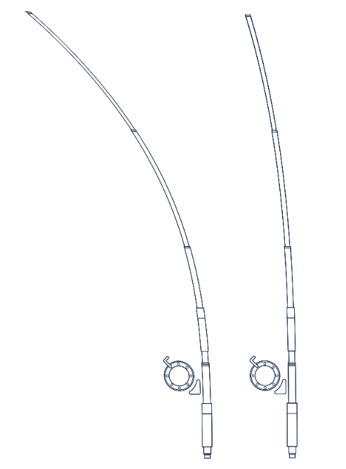
I designed this finishing rod for another page in the book however their is another page which covers rod tention, so instead of drawing the same rod out again 3 times at different tentions, i took the original and using the warp tool on photoshop managed to curve just the top edge of it.


proper bait - repeat pattern
Creating repeat patterns to use within the book to between the cover and page one,
messing around on photoshop with editing fish photographs until i find a style which works well.


changing the colours of the fish to match the colourscheme used within the book.


I really like this design, simple and straight to the point.

i really like these fish repeats, and feel that they would work great for within the book, however their is not really much going on and it is something that i have seen be done a thousand times in different contexts so i feel the previous direction would be right way to go.


Subscribe to:
Posts (Atom)