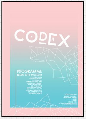
Beginning work on the publication, designing the front cover, i had a concept in my head initially as to what the cover would look like, using the same pink as i had previously picked out in other design work and a strong blue gradient to really make the design pop out aswel as give a really nice modern aesthetic.
i started with experimenting with blue at the top and bottom of the design to hold information, just to try to make it that little bit different, however it wasnt really working out as well as it had hoped.
changing the size of logo to make it stand out better.
beginning to apply shaped and patterns to the design as recommended by max, i sketched out where i felt the patterns would fit in the design and then useing the pen and path tool began creating them. Designs that seem somewhat random which are suppost to represent data and coding, feel it really makes the design stand out.
minor alterations to the type layout and point sized and, finished programme cover.
feel it works really well, you get a feel as to what the programme is for just from the look of the cover, modern technology.


No comments:
Post a Comment