Thursday 26 May 2011

end of module, self evaluation.

BA (Hons.) GRAPHIC DESIGN - LEVEL 4 
Module Code - OUGD103
Module Title – Design Practice 1.
End of Module Self Evaluation
Name - Eddie cooper
Blog - www.e-cooper1013.blogspot.com

1.  What skills have you developed through this module and how effectively do you think you have applied them?

i had previously struggled with group projects being stuck in a group that doesnt seem to function well together and their is no communication, however with communication is a virus i felt the group worked really well together, we completed tasks as a group instead of splitting up and used each others opinions and skills throughout the brief, so i feel i have definitely developed my team working skills. Also learning how to use indesign has proved very useful, a programme that i had nether used before and although it is abit awkward at times it is very useful and i think i will be definitely be using in the future. My illustration skills i feel had been developed as-well through the speaking from experience brief, i took on a completely new style of working and drawing to created outcome that were mainly illustrative based, which is something i had never really done before, stepped out of my comfort zone and i think it payed off. 
2. What approaches to/methods of research have you developed and how have they informed your design development process?  
i used questionnaires and secondary source research allot more in this module, maybe because it was easily accessible as the product was practically aimed towards us, which were  very helpful in allowing me to reflect on the research which i received making sure my product would actually work and people would want to see it.

3. What strengths can you identify in your work and how have/will you capitalise on these?  
illustration, i feel the illustration style that i have been using is very effective and works really well which i would hope to carry on using throughout further briefs.

4. What weaknesses can you identify in your work and how will you address these more fully? 

i find that i struggle with any 'serious' types of work, like im really fine with illustration a silly drawing on illustrator or a joke for the speaking from experience brief however with things such a buisiness cards, logos and website designs i just could do, i could seem to come up with any concepts that were in any way visually engaging. To address this i might try tackle a brief in a more serious manor, maybe make some buisines cards and things, just get as much practice in a possible.


5. Identify five things that you will do differently next time and what do you expect to gain from doing these?  
1/ manage time around hospital visit
2/ Experiment more during the development stages of my work rather than keeping too focused on one idea. 
3/ keep up to date 
4/ not get annoyed by criticism 
5/ try a more serious approach to answering a brief.

6.How would you grade yourself on the following areas:
(please indicate using an ‘x’) 

5= excellent, 4 = very good, 3 = good, 2 = average, 1 = poor

1
2
3
4
5
Attendance


x


Punctuality


x

Motivation


x

Commitment


x

Quantity of work produced


x


Quality of work produced


x

Contribution to the group


x

design is about doing. final poster.

here are the 3 type, type and image and image posters.


i missed allot of this brief, because it was only a 1 week brief and i had to go back home to go to hospital in the middle of it i only had 1 lesson of studio sessions to work on these posters, which really messed me up, im not too pleased with my outcome, definitely not the greatest things ive ever made however i think if i had been able to spend more time on the brief i could of make something really quite interesting, especially with the subject that i used and the ideas that i had.

Wednesday 25 May 2011

indesign

final design

kind of took my favourite elements from my initial ideas and combined them to create a final layout.

i decided to use the typeface abadi mt limited because i thought i best suited yaffs personality, its is nice formal looking font but with a fun quirky look to it. A really modern looking typeface.


________________

 final design, decided to go for white stock, i felt it gave the article a cleaner, more profesional look.

indesign

initial layouts.
trying out some initial ideas for the magazine layout.


indesign

design sheets

indesign

an interview with yafet,
I asked yaff a few questions which could be included within my magazine.


how fast can you run?
    about as fast as a taxi


if you could be any animal what would it be?
    a bear, because they are hairy and powerful


what do you do in your spare time?
    golf ofcoarse, im also a fan of fishing and shooting


favourite season?
    autumn, its the prettiest season


If you could have any super power what would it be?
    to fly.


where are you from?
    the ghetto of new moston


what crazy things do you get up to in new moston?
    well, quite allot really, this one time, a few years back, you will never believe this, i dropped some food yeh, and then i waited 30 seconds, picked it up, and ate it, i dont follow no 5 second rule, i eat when i want to eat. Oh my and another time a friend of mine asked me for a tea but i however made him a coffee, ooo he was not happy.

favourite soup?

    tomat, 


metal or wood?
    wood


favourite element?
    wind


favourite pokemon?
    charmander, i would always start of with a charmander, easily the best of the 3 start up pokemon, also it evolves into charizard and he is one tough cookie.


have you ever shot anyone?
    only now and then, shot a couple of people in my life. why? whos asking?


i heard somewhere you wanted to open your own tea shop, please tell me about this.
      Well firstly, ideas for the name - deriving from the musical genius Flying Lotus - at the moment stand at Tea Leaf Dancers. I know, sick right? Inside the shop will be a selection of flavoured tea gathered from all over the world. Herbal tea is a definite no, normal tea only - e.g with milk and  shit. Walls, ceilings, floors, tables, even people are all considered as canvases as you get a pen to use once you enter. A shit load of shits going down and shit on the music front.

indesign

i then edited some of the photographs so i could use them within my magazine layout.


indesign

For the indesign brief we were asked to produce a double page spread article for another person the class, i was not in on the day this brief was given out so i was not given a pair to work with, therefore i asked Yaf is he would be my subject and used him.
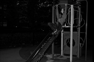
To start off the project we went to the park, so i could take some edgy photographs of yaff being yaff.


Type and Grids n stuff.

workshop with lorenzo.
we were asked to bring along with us 2 magazine articles, a high rate magazine and a low rate one, each covering similar stories.
these were the articles i took along.

highrate

lowrate

i then compared the difference.

word count
cheap - 76
expensive - 180

quick statement about each article
cheap - tips on whats hot in the festival season, what to wear and not to wear.
expensive - similar magazine, showing top tips on whats hot in fashion through august.

5 differences between the 2
1. the expensive magazine uses more formal looking typefaces, serifs, giving it a more upperclass appearance, more elegant.
2. the cheaper magazine is very colourful very eyecatching wheras the expensive one uses limited, grey scaled colours.
3. the cheap magazine uses dodgy illustrative title making it look cheap and tacky
4. the high-rate magazine is allot more structured and laid out nice making it look safisticated whereas the low-rate magazine looks as if it has just been thrown together.
5. the cheap magazine uses unnecessarily large images, possibly just to fill the page.
6. expensive magazine uses allot of white space giving it a more professional, formal look.

i then redesigned the layout of the magazines using a grid, this is the grid i used for each one.