Tuesday, 11 December 2012
proper bait - hard back covers
Before screen printing i had to create the hard back covers for the book, the bind i am planning to use is the japanese stab bind so the front cover has to have at least 2 cm bind space down the left hand side, along with a gab/crease in the hard back material to allow the cover to fold and open up.
proper bait - cover screen print
Messing around with the layout of the cover, trying to get it right before screen printing later on.
here are some variations.
proper bait - finished book
Final finished book that i have laid out, ready for a test print.
really happy with how it looks at the minute, pretty excited to get it printed and bound.
proper bait - grid
The grid that has been used throughout the book, created for maximum readability, to efficiently place a lot of text on a relatively small page and so each page of the book follows a similar formula allowing the book the flow visually from page to page.
Here is a break down of the grid, yellow for the introduction, red for body text, with green for images.
Grid in context
proper bait - illustrations
One of the good things about this book was the amount of illustrations needed to create it, which was great getting back into that. Also trying a style of illustration that i am not too familiar with, minimalistic, kind of iconography style. Here are some of the illustrations that i have designed for the book and how i went about it.
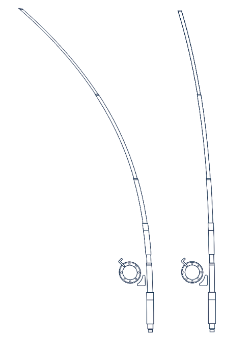
I designed this finishing rod for another page in the book however their is another page which covers rod tention, so instead of drawing the same rod out again 3 times at different tentions, i took the original and using the warp tool on photoshop managed to curve just the top edge of it.
Illustrations in context with type, feel the simple minamisltic style flows really well with the rest of the book.
proper bait - repeat pattern
Creating repeat patterns to use within the book to between the cover and page one,
messing around on photoshop with editing fish photographs until i find a style which works well.
changing the colours of the fish to match the colourscheme used within the book.
I really like this design, simple and straight to the point.
i really like these fish repeats, and feel that they would work great for within the book, however their is not really much going on and it is something that i have seen be done a thousand times in different contexts so i feel the previous direction would be right way to go.
proper bait - layout
Beginning laying out the content for the book, here is some of the development stages throughout designing.
Aligning the contents page, at this stage i decided that to add visual consistency throughout the book that i should apply the blue hard back and gold screen print from the cover design to the text and have this colour scheme run through the whole book.
Applying the same grid with subtle changes throughout the book to add keep the book flowing well from page to page
changing alignment of text to find what would work best
Subscribe to:
Posts (Atom)